Featured in The Best Negative Space Logo Designs of 2024 by DesignRush, Best Design Awards.
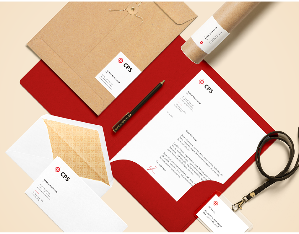
Award: 1st Prize Branding Award Winner out of 600 participants, contest hold by Dave Stewart (Eurythmics) and financial expert Michael Phillip (Credit Suisse and Deutsche Bank). *This concept was the start of a complete branding that took place in LA.
Business vision: The brand identity needed to have a clear and distinctive position against the rest of the banking industry, with the purpose to become the trusted partner of the global creative economy.
Creative Solution: Taking into consideration that the logo is the sum of the company’s philosophy, I created a simple, functional and trustworthy mark. The main concept that stays behind the logo is the positive use of negative space in order to have an impact, hiding and in the same time highlighting subtle the “A” (Artist), the center of composition (introverted or extroverted artists). The "A" creates an invisible line from left to right and down to up, having the significance of future and progress. The connection between the letters “F”, “A”, “B” is covering the message: “we (FAB) build together for you (A)” (built by artists for artists) and the square shape represents the power and confidence of a bank. In order to represent an original mark that emphasizes professionalism, regarding the symbol, I created a customized typography, using geometry and balanced angles. The logo is legible in small size and works in Black & White, Grayscale and any color as well.


