Client: CandL is a high quality brand headquartered in Aachen Germany, focusing on eco-friendly kitchenware and home products, being responsible for distribution, marketing, trading and global sourcing across all sectors between Europe and Asia.
Business vision: CandL wanted to have a distinctive brand, one that shows to their customers that they can offer high-quality eco-friendly kitchenware and home products which benefits to their health.
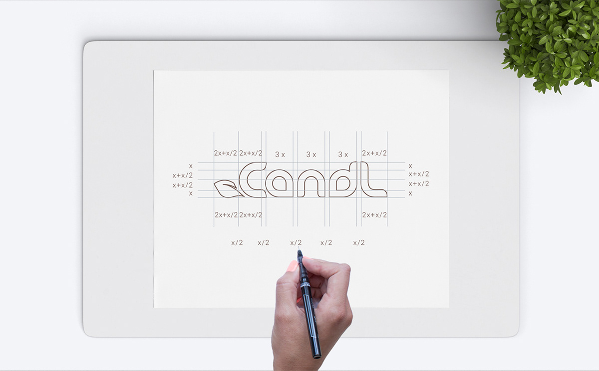
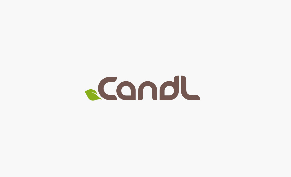
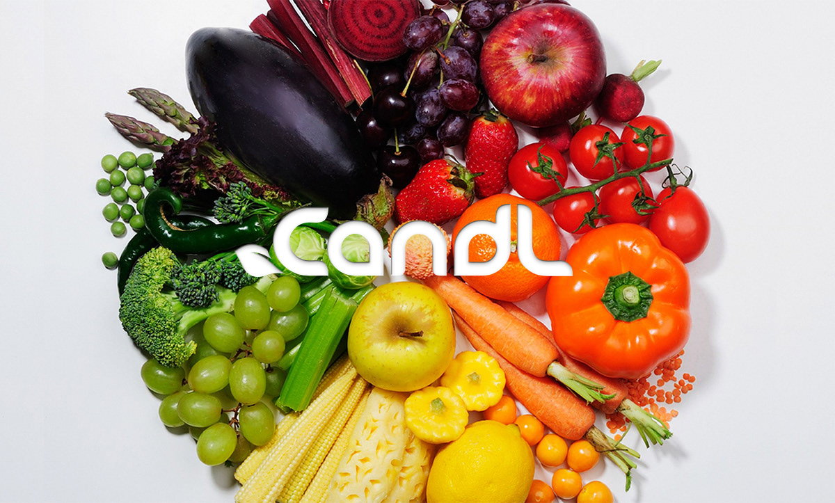
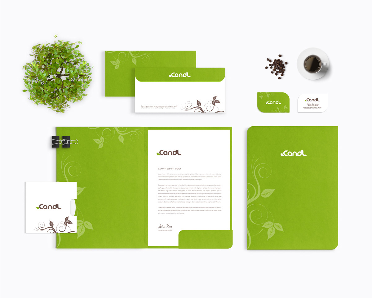
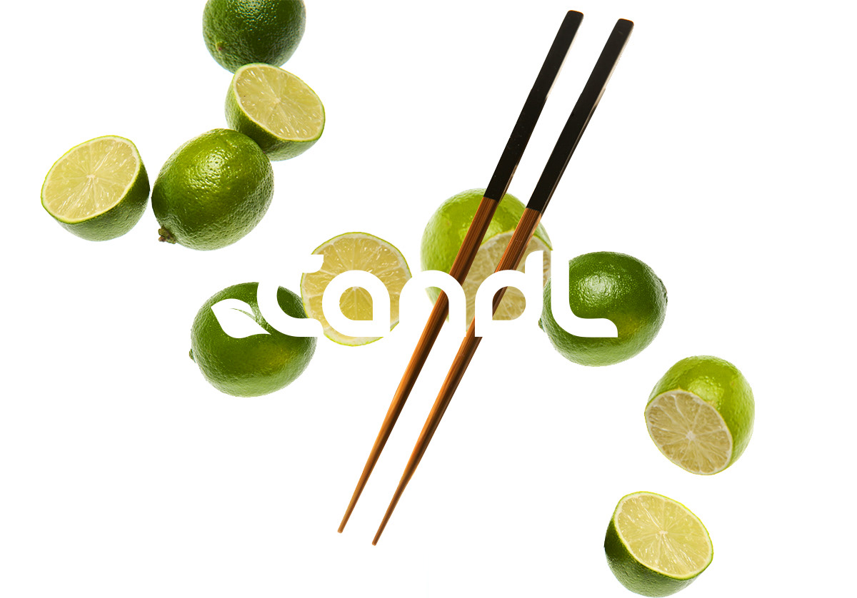
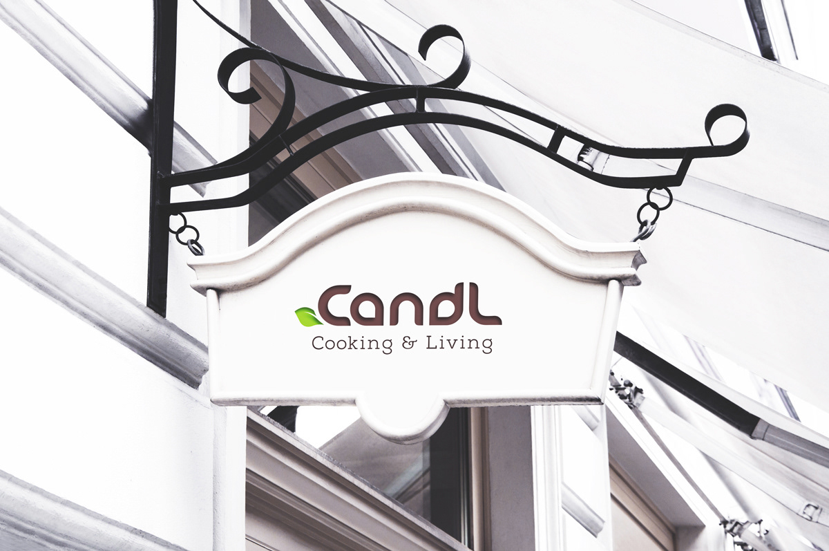
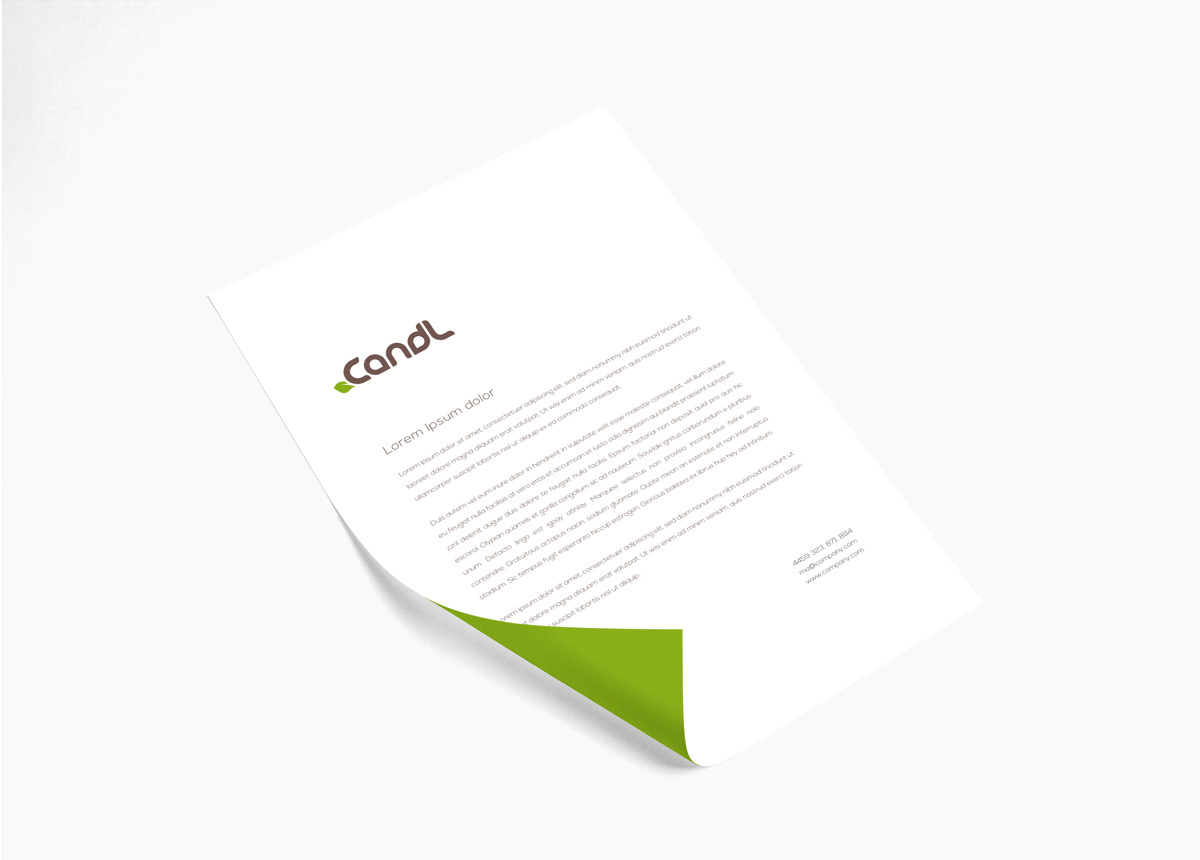
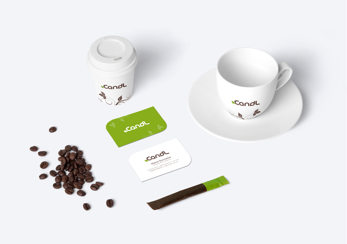
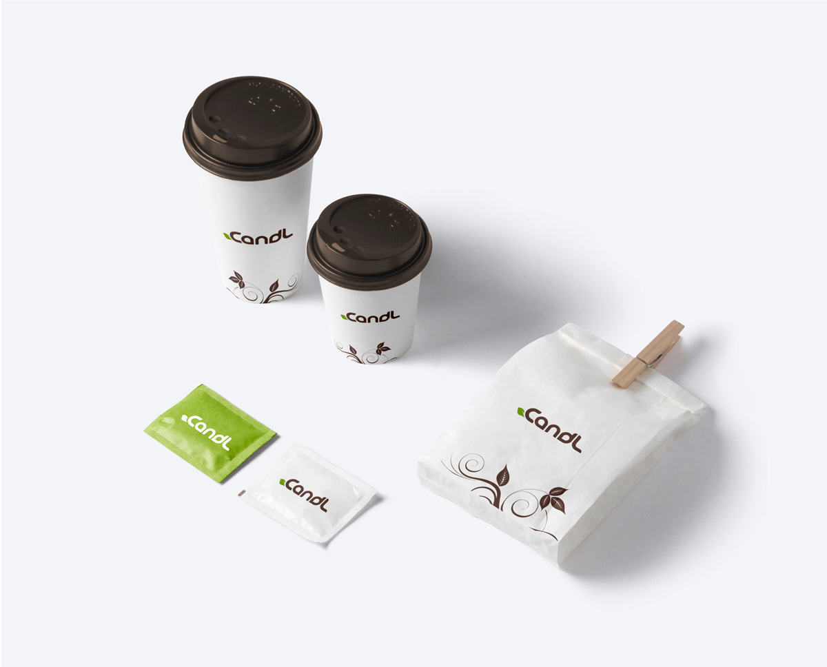
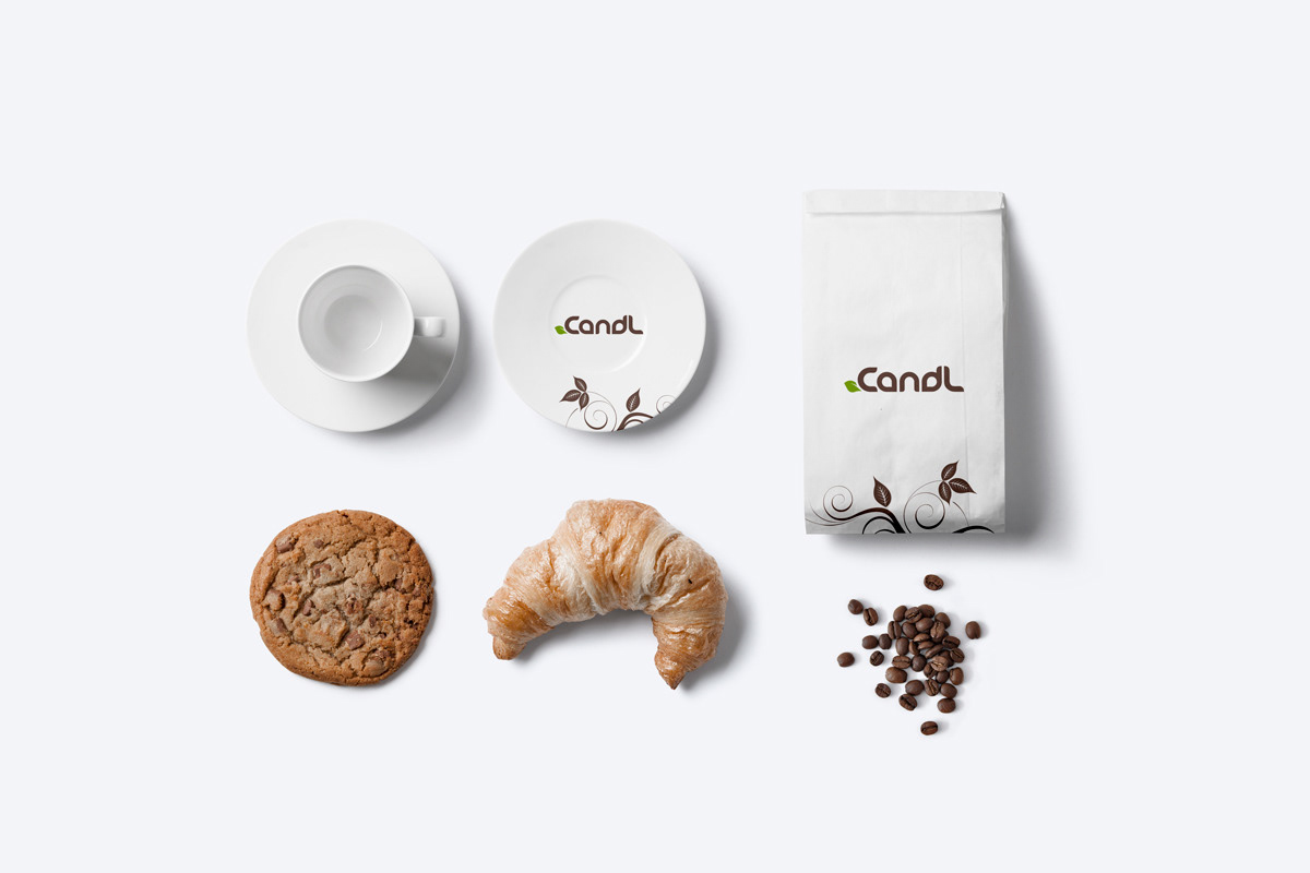
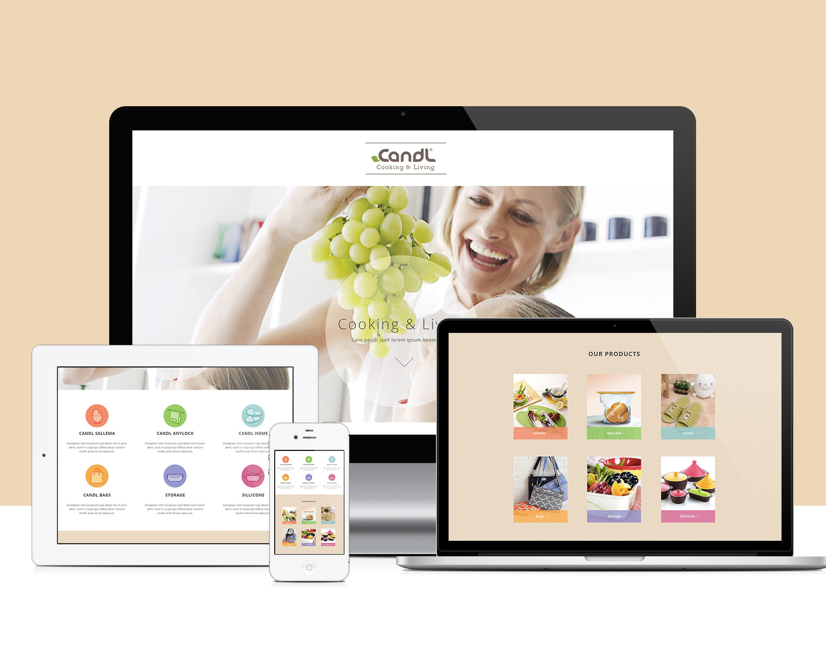
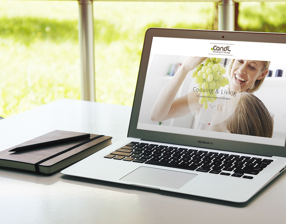
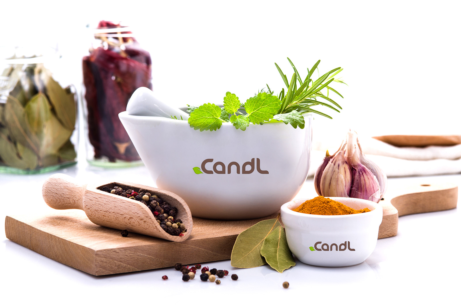
Creative solution: In order to visually and emotionally connect the customer with the product, my approach was to connect three key elements: food -> life -> cuisine = product. Based on the these elements, I created a simple, but effective organic logo represented by a customized font connected with a leaf and developed it into a complete branding identity. The leaf has the meaning of life and highlights the eco-friendly characteristics of the products which embraces better the philosophy of the company. Keeping in mind the three pillars of the company: high-quality, eco-friendly and distinctive, the purpose was to represent a full identity where the logotype compliments the shape of the leaf and the leaf compliments the corporate identity. For this reason, the color palette was chosen to: green and brown. Green is usually associated with wealthy, eco-friendly products and is the easiest color for the eyes to process in a store and brown indicates utility do its simplicity, warmth and neutrality.
Services: Branding, Web Design, Art Direction